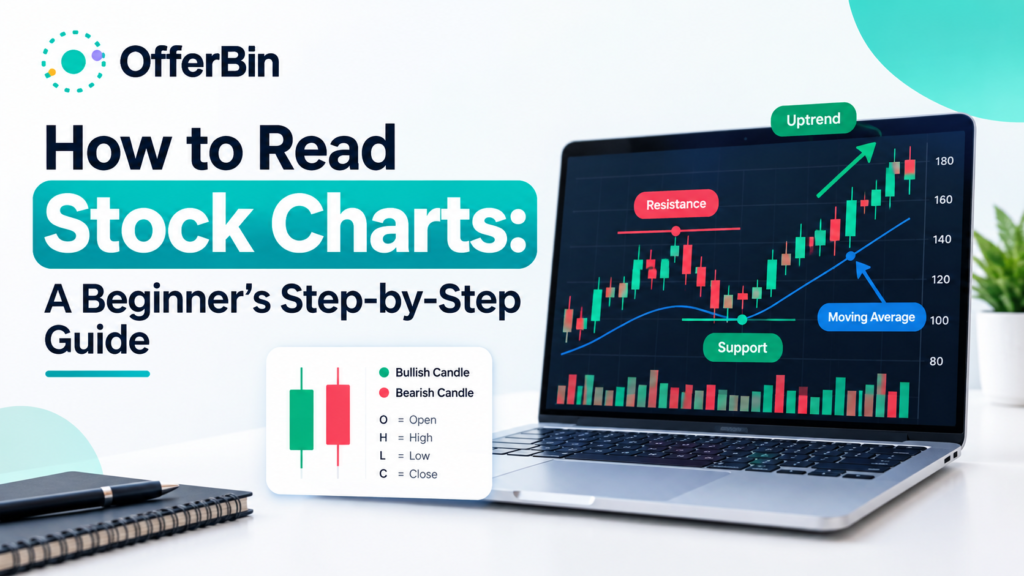
A stock chart shows how a stock’s price has moved over a period of time. To read one, start with the timeframe and overall trend, then examine price levels, candlesticks, trading volume, and selected indicators. The goal is to understand what the chart is showing—not to assume it can predict exactly what happens next.
If you’re new to stock charts, the amount of information on a typical chart can look overwhelming. Lines, candles, numbers, volume bars, indicators, and patterns can all appear at once.
The good news is that you don’t need to understand everything immediately.
A practical way to read a stock chart is to work through it in a consistent order:
Timeframe → Trend → Key levels → Volume → Candlesticks → Indicators → Patterns → Context
This guide explains each step in plain language and shows how the different pieces fit together.
What Is a Stock Chart?
A stock chart is a visual representation of a stock’s price movement over time. Depending on the chart type, it can also show information such as the opening price, highest price, lowest price, closing price, and trading volume.
Most stock charts have two basic axes:
- Horizontal axis: represents time.
- Vertical axis: represents price.
For example, a daily chart may show one trading day at a time, while an intraday chart could show price movement minute by minute.
A chart helps you see historical price behavior quickly. It can show whether price has generally moved upward, downward, or sideways and where important price levels have developed.
However, a chart does not contain every factor that can affect a stock. Company earnings, economic conditions, interest rates, news, management decisions, valuation, and other fundamental factors may also influence prices.
How to Read a Stock Chart Step by Step
You can make stock chart analysis much easier by following the same sequence every time.
Start With the Timeframe
Before interpreting a chart, check its timeframe.
A chart can look completely different depending on whether you’re viewing:
- One-minute candles
- Five-minute candles
- One-hour candles
- Daily candles
- Weekly candles
- Monthly candles
A short timeframe shows smaller price movements, while a longer timeframe can make broader trends easier to see.
For beginners, starting with a daily or weekly chart can make it easier to understand the bigger picture before looking at shorter-term movements.
Check the Overall Trend
Next, ask a simple question:
Is the stock moving generally upward, downward, or sideways?
An uptrend commonly features a sequence of higher highs and higher lows.
A downtrend commonly features lower highs and lower lows.
A sideways market moves within a relatively defined range without a clear sustained upward or downward direction.
Don’t determine the trend from one candle. Look at a meaningful section of the chart and consider how the sequence of highs and lows is developing.
Identify Support and Resistance
After identifying the trend, look for important price areas.
Support is an area where buying interest has previously helped slow or stop a decline.
Resistance is an area where selling pressure has previously helped slow or stop an advance.
These are better understood as zones rather than perfectly precise lines. Price can move slightly through a level before reversing, and previous support can sometimes become resistance after a breakdown.
Look at Trading Volume
Volume tells you how many shares changed hands during a particular period.
Price and volume can provide useful context when viewed together.
For example:
- Rising price with increasing volume can indicate stronger participation.
- A price move on unusually low volume may deserve additional scrutiny.
- High volume during a breakout can provide additional context.
- A sudden volume spike can accompany important news or significant price movement.
Volume does not automatically confirm that a move will continue. It is one piece of information among several.
Read the Latest Candlesticks
Once you understand the broader trend, examine the latest candles.
Look at:
- Candle direction
- Candle body size
- Upper wick
- Lower wick
- Position relative to recent price levels
- Volume during the move
A single candle rarely provides enough information by itself. Its meaning depends heavily on where it appears on the chart and what price was doing beforehand.
Check a Small Number of Indicators
Indicators can help organize price information, but more indicators do not necessarily produce better analysis.
Common examples include:
- Moving averages
- Relative Strength Index (RSI)
- Moving Average Convergence Divergence (MACD)
For beginners, it can be more useful to understand one or two indicators properly than to place a large collection of indicators on the same chart.
Look for Chart Patterns
Finally, you can consider whether a recognizable chart pattern is developing.
Examples include:
- Double tops
- Double bottoms
- Head and shoulders
- Triangles
- Flags
Patterns should be treated as potential interpretations rather than guaranteed forecasts. Context, volume, timeframe, and the broader market can all affect how a pattern develops.
Stock Chart Types Explained
Different chart types present price information in different ways.
| Chart type | What it shows | Best use |
|---|---|---|
| Line chart | Usually closing prices connected over time | Seeing the broad trend |
| Bar chart | Open, high, low and close | Detailed price analysis |
| Candlestick chart | Open, high, low and close in an easy-to-read visual format | Price action and chart analysis |
Line Charts
Line charts are among the simplest stock charts.
A line connects a series of prices—often closing prices—to show how the stock moved over time.
They’re useful when you want to quickly see the overall direction without being distracted by individual intraday movements.
Bar Charts
A traditional price bar contains information about the stock’s:
- Open
- High
- Low
- Close
This is commonly abbreviated as OHLC.
The bar’s high and low show the trading range for that period, while small horizontal marks indicate the opening and closing prices.
Candlestick Charts
Candlestick charts contain the same basic OHLC information but present it in a more visual format.
Each candle can quickly show:
- Where price opened
- Where price closed
- The highest price reached
- The lowest price reached
This makes candlestick charts particularly popular for technical analysis.
How to Read Candlestick Charts
A candlestick has two main visual components:
Body: shows the relationship between the opening and closing prices.
Wicks or shadows: show prices reached above and below the candle’s body.
The exact colors depend on the charting platform, but many platforms use green for a period where the closing price was higher than the opening price and red for a period where the closing price was lower.
What Do Green and Red Candles Mean?
A green candle generally means the closing price was above the opening price for that period.
A red candle generally means the closing price was below the opening price.
The color alone does not tell you what happens next.
For example, a large green candle near resistance can mean something very different from a large green candle breaking above a long-established trading range.
What Do the Wicks Mean?
The upper wick shows how high price moved during the period before closing.
The lower wick shows how low price moved.
Long wicks can show that price moved significantly away from the eventual closing area during that period.
Again, context matters. A long lower wick near a support zone has a different context from a long lower wick during a strong downtrend.
How to Identify Trends on Stock Charts
Trend analysis is one of the most useful starting points when reading a stock chart.
Uptrend
An uptrend generally develops through a series of:
Higher highs + higher lows
The stock is repeatedly reaching higher price levels while pullbacks are holding above previous lows.
Downtrend
A downtrend generally develops through:
Lower highs + lower lows
Rallies fail to reach previous highs, while declines continue to establish lower lows.
Sideways Trend
A stock may also trade sideways.
In this situation, price repeatedly moves between a relatively defined upper and lower area without establishing a sustained directional trend.
Sideways markets are sometimes described as ranges or consolidations.
Why Higher Highs and Higher Lows Matter
Looking at highs and lows can be more useful than simply asking whether a stock is “going up.”
A stock may rise sharply for several days but still be part of a broader downtrend if its longer-term structure continues to produce lower highs and lower lows.
This is why timeframe matters.
Support and Resistance Explained
Support and resistance are common concepts in stock chart analysis.
What Is Support?
Support is a price area where previous selling pressure has been met by enough buying activity to slow or reverse a decline.
Support isn’t guaranteed to hold.
If selling pressure becomes strong enough, price can move below the area.
What Is Resistance?
Resistance is a price area where previous upward movement has encountered selling pressure.
A stock can break above resistance, remain below it, or briefly move above it and then fall back.
How to Identify Support and Resistance on a Chart
Look for areas where price has repeatedly:
- Reversed upward
- Reversed downward
- Paused before continuing
- Consolidated
- Reacted strongly
The more frequently price reacts around an area, the more noticeable that zone may become.
But there is no universal rule that makes a particular support or resistance level certain to hold.
Support and Resistance Zones
It’s often better to think in terms of zones rather than exact numbers.
For example, if a stock repeatedly reacts between $48 and $50, treating $49.00 as an exact dividing line may create a false sense of precision.
A broader zone can better represent the historical price behavior.
How to Read Stock Volume
Volume measures the number of shares traded during a particular period.
It is usually displayed below the main price chart as vertical bars.
Volume can help provide context for price movements.
Rising Price and Volume
If price rises while volume also increases, the move is occurring alongside greater trading activity.
That may provide useful confirmation, but it does not guarantee that the trend will continue.
Falling Price and Volume
A decline accompanied by elevated volume can indicate significant participation during the move.
Again, the information should be interpreted alongside the broader trend and price structure.
Volume During Breakouts
Volume is often watched when price moves beyond an established resistance or support area.
A breakout accompanied by noticeably higher volume may attract more attention than a move through the same level on unusually low volume.
However, breakouts can fail.
A move above resistance that quickly falls back into the previous range is sometimes described as a false breakout.
Moving Averages and Other Stock Chart Indicators
Indicators transform or organize price and volume data to help traders examine particular aspects of market behavior.
They should not be treated as automatic buy or sell signals.
Simple Moving Average
A Simple Moving Average (SMA) calculates the average price over a specified number of periods.
For example, a 50-day SMA uses the prices from the relevant 50 trading days to calculate an average that changes as new data arrives.
Moving averages can help smooth short-term price fluctuations and make broader trends easier to observe.
Exponential Moving Average
An Exponential Moving Average (EMA) gives greater weight to more recent prices than a simple moving average.
As a result, it can respond more quickly to recent price changes.
Relative Strength Index
The Relative Strength Index (RSI) is a momentum indicator commonly displayed on a scale from 0 to 100.
It is often used to assess the strength of recent price movements and identify potentially overextended conditions.
An RSI reading should not be interpreted in isolation or treated as proof that a stock must reverse.
MACD
The Moving Average Convergence Divergence (MACD) is another momentum and trend-related indicator.
It compares moving averages and can help users examine changes in momentum and trend behavior.
As with other indicators, the MACD is most useful when understood in the context of the underlying price action.
Avoid Indicator Overload
A common beginner mistake is adding many indicators because the chart looks more sophisticated.
More information can actually make a chart harder to interpret.
Start with the basic price structure. Add an indicator only when you understand what question it is helping you answer.
Common Stock Chart Patterns
Chart patterns describe recurring formations in price data.
They can be useful for organizing what you see, but patterns are not guarantees of future price direction.
Double Top
A double top occurs when price reaches a similar high on two occasions and struggles to move beyond the area.
The pattern is generally interpreted in the context of what happens after the second attempt.
Double Bottom
A double bottom is broadly the opposite structure, where price tests a similar low twice before moving away from the area.
Head and Shoulders
A head-and-shoulders structure typically contains:
- A first peak
- A higher central peak
- A third peak that is lower than the central peak
The lows between these peaks are often connected conceptually by a neckline.
Triangles
Triangle patterns form when price moves within converging boundaries.
Common descriptions include:
- Ascending triangle
- Descending triangle
- Symmetrical triangle
The eventual direction is not guaranteed simply because a triangle appears.
Flags
Flag patterns are generally short-term consolidation structures that occur after a noticeable price movement.
As with all chart patterns, context is important.
A Simple Stock Chart Analysis Example
Imagine you’re looking at a hypothetical daily stock chart.
The first thing you notice is that price has been producing higher highs and higher lows over several weeks.
That suggests an upward trend.
Next, you identify a price zone where previous pullbacks stopped. That becomes an area of potential support.
You also identify a higher price area where previous advances struggled. That’s a potential resistance zone.
Then you examine volume.
The latest upward move occurred with higher-than-usual volume, giving you additional information about participation during the move.
You then inspect the most recent candles. Instead of focusing on one candle, you compare the latest candles with the surrounding price action.
Finally, you look at a moving average to see whether it provides useful additional context.
The result is not a prediction.
Instead, you’ve built a structured description of the chart:
- Timeframe: Daily
- Trend: Upward
- Structure: Higher highs and higher lows
- Support: Identified below recent price
- Resistance: Identified above recent price
- Volume: Elevated during the recent move
- Candles: Reviewed in context
- Indicator: Used as supporting information
This is a much more useful way to approach stock chart analysis than trying to find one “magic” signal.
Common Mistakes Beginners Make
Looking at Only One Candle
One candle rarely explains the entire market structure.
Always consider surrounding price action.
Ignoring the Timeframe
A stock can look bullish on a five-minute chart while looking bearish on a weekly chart.
Always know which timeframe you’re analyzing.
Using Too Many Indicators
A chart covered in indicators can create confusion rather than clarity.
Start with price and volume before adding additional tools.
Treating Patterns as Guarantees
A chart pattern is an interpretation of historical price behavior.
It is not a guarantee of future performance.
Ignoring Volume
Price can tell you where the market moved. Volume can provide additional context about trading activity during that move.
Assuming Support or Resistance Must Hold
Support and resistance are areas of historical price reaction, not permanent barriers.
Confusing Technical Analysis With Fundamental Analysis
A chart primarily shows market data such as price and volume.
It does not automatically tell you:
- Whether a company is profitable
- Whether its valuation is attractive
- Whether revenue is growing
- Whether management is effective
- Whether a product will succeed
Those questions require other forms of research.
Stock Chart Reading Checklist
Before drawing conclusions from a stock chart, ask:
- What timeframe am I viewing?
- What does the broader trend look like?
- Are highs and lows rising or falling?
- Where are the major support zones?
- Where are the major resistance zones?
- What is trading volume doing?
- What do the latest candlesticks show?
- Is there a recognizable chart pattern?
- Are indicators actually adding useful information?
- Is the broader market affecting the stock?
- Am I interpreting a possibility as if it were a certainty?
- What important information isn’t visible on the chart?
This checklist can help prevent you from focusing too heavily on one signal.
Can Stock Charts Predict Future Prices?
No chart can guarantee what a stock will do next.
Stock charts are primarily tools for examining historical price and volume behavior. Technical analysis can help users identify trends, levels, patterns and changes in momentum, but those observations do not remove uncertainty.
Future prices can be affected by information that isn’t visible on a chart, including company results, economic data, interest rates, news, regulations and unexpected events.
For that reason, chart analysis is better understood as a method of interpreting market data than as a reliable prediction machine.
Technical Analysis vs. Fundamental Analysis
Technical and fundamental analysis approach markets from different angles.
| Technical analysis | Fundamental analysis |
|---|---|
| Focuses heavily on price and volume | Focuses on business and economic factors |
| Uses charts and indicators | Uses financial statements, valuation and business information |
| Examines historical market behavior | Examines underlying financial and economic conditions |
| Often emphasizes trends and patterns | Often emphasizes earnings, cash flow and valuation |
These approaches don’t necessarily have to be treated as mutually exclusive. They answer different questions.
How to Get Better at Reading Stock Charts
The best way to improve is to practice interpreting charts systematically.
Start with the basics:
- Choose a timeframe.
- Identify the overall trend.
- Mark obvious support and resistance zones.
- Examine volume.
- Read the latest candlesticks.
- Add only the indicators you understand.
- Look for patterns.
- Write down what the chart actually shows.
- Separate observations from assumptions.
- Review what happened afterward without changing your original interpretation.
That last step is especially useful for learning. It helps you evaluate whether your interpretation was supported by the information available at the time rather than judging it only from hindsight.
FAQs About Reading Stock Charts
How do you read stock charts for beginners?
Start by identifying the timeframe and overall trend. Then examine higher highs and lower lows, support and resistance, trading volume, candlesticks and a small number of useful indicators. Focus on the complete price structure rather than trying to interpret one candle or indicator in isolation.
What do the lines on a stock chart mean?
Lines can represent different types of information. The main price line may connect closing prices, while other lines may represent moving averages, trendlines, support or resistance. Always check the chart legend or indicator label to determine exactly what a particular line represents.
What do green and red candles mean?
On many charting platforms, a green candle means the closing price was higher than the opening price, while a red candle means the closing price was lower than the opening price. Color conventions can vary, so check your charting platform’s settings.
What are OHLC prices?
OHLC stands for Open, High, Low and Close. These four values describe the opening price, highest price, lowest price and closing price for a specific trading period.
How do you identify an uptrend?
An uptrend generally features a sequence of higher highs and higher lows. Rather than relying on one upward move, look at the broader structure of the chart and consider the timeframe you’re analyzing.
How do you identify support and resistance?
Look for price areas where the stock has repeatedly paused, reversed or struggled to move through. Support generally refers to areas where declines have previously slowed, while resistance refers to areas where advances have previously encountered selling pressure.
What does volume tell you on a stock chart?
Volume shows how many shares were traded during a particular period. It can provide context for price movements, including whether a breakout or decline occurred alongside unusually high trading activity.
What is the best timeframe for reading stock charts?
There is no single best timeframe for everyone. The appropriate timeframe depends on the question being analyzed. Longer timeframes can help reveal broader trends, while shorter timeframes show more detailed price movements.
Which indicators should beginners use?
Beginners can start by understanding basic tools such as moving averages, RSI and MACD. The important point is not to use as many indicators as possible, but to understand what each indicator measures and how it complements the price chart.
Can stock charts predict stock prices?
No. Charts can help analyze historical price and volume behavior, but they cannot guarantee future price movements. Market prices can change because of company-specific, economic, political, regulatory and other unexpected factors.
Final Takeaway
Learning how to read stock charts becomes easier when you stop trying to interpret everything at once.
Start with the timeframe, then examine the trend, support and resistance, volume, and candlesticks. After that, use indicators and chart patterns as supporting information rather than treating them as guaranteed signals.
The most useful question isn’t simply, “What pattern is this?”
It’s:
“What is the chart actually showing, what evidence supports that interpretation, and what remains uncertain?”
That approach can help you read stock charts more systematically while avoiding many of the common mistakes beginners make.